Essential Components: Buttons, Badges & Alerts
Subject: BootstrapBootstrap 5 includes pre-styled user interface components that help you quickly build interactive elements like clickable action buttons, notification badges, and alert banners.
Key Concepts to Remember
1. Buttons (btn): use the base .btn class combined with contextual color variants like .btn-primary, .btn-success, .btn-danger, or .btn-outline-primary for bordered styles.
Button sizes can be adjusted using .btn-lg or .btn-sm.
2. Badges (badge): badges are used to highlight new or unread items, status indicators, or counts (e.g., notification counters). Combine .badge with color classes like .bg-danger or use .rounded-pill for rounded capsule styles.
3. Alerts (alert): alerts provide feedback messages for user actions (e.g., success messages, error warnings). Use .alert with a modifier class like .alert-success or .alert-warning. Add .alert-dismissible along with a close button if you want users to be able to dismiss them.
<!DOCTYPE html>
<html lang="en">
<head>
    <title>Bootstrap Buttons, Badges & Alerts Example</title>
    <meta charset="utf-8">
    <meta name="viewport" content="width=device-width, initial-scale=1">

    <!-- Bootstrap 5 CSS CDN -->
    <link href="https://cdn.jsdelivr.net/npm/bootstrap@5.3.3/dist/css/bootstrap.min.css" rel="stylesheet">
</head>
<body>

    <div class="container mt-5">
        <h1>Essential Components</h1>
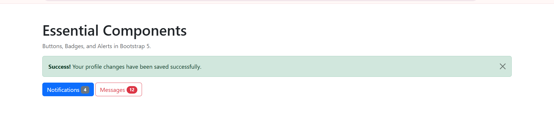
        <p class="text-muted">Buttons, Badges, and Alerts in Bootstrap 5.</p>

        <!-- Alerts -->
        <div class="alert alert-success alert-dismissible fade show" role="alert">
            <strong>Success!</strong> Your profile changes have been saved successfully.
            <button type="button" class="btn-close" data-bs-dismiss="alert" aria-label="Close"></button>
        </div>

        <!-- Buttons and Badges -->
        <div class="mb-4">
            <button type="button" class="btn btn-primary">
                Notifications <span class="badge bg-secondary">4</span>
            </button>
            <button type="button" class="btn btn-outline-danger">
                Messages <span class="badge bg-danger rounded-pill">12</span>
            </button>
        </div>
    </div>

    <!-- Bootstrap 5 JavaScript Bundle CDN (Required for dismissible alerts & interactive components) -->
    <script src="https://cdn.jsdelivr.net/npm/bootstrap@5.3.3/dist/js/bootstrap.bundle.min.js"></script>
</body>
</html>
By: Benjamin Onuorah
Comments
No Comment yet!
Login to comment or ask question on this topic
Previous Topic
- 1 Introduction to CSS
- 2 Bootstrap Introduction & Setup
- 3 Layout & The Grid System
- 4 Spacing, Colors & Typography
- 5 Core Content & Media Elements
- 6 Essential Components: Buttons, Badges & Alerts